This lesson walks through the Hierarchy of Controls dashboard: where your control work across the portfolio shows its effectiveness.
What you'll cover:
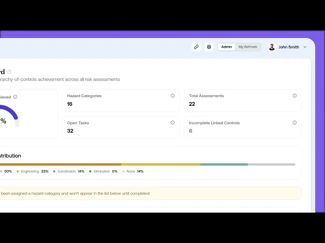
The KPI tiles. The five tiles across the top: Target Achieved (the percentage of risks that have hit their target hierarchy level), Hazard Categories, Total Assessments, Open Tasks, and Incomplete Linked Controls (in red, the controls that don't yet evidence the target level).
The achieved distribution. The Achieved Hierarchy Distribution bar, with six segments weakest to strongest (Personal, Administrative, Engineering, Substitution, Elimination, plus None) showing where your portfolio actually sits.
The category table. The breakdown by hazard category, with Assessments and Open Tasks per category and a Target column marking each as Met or Needs Attention.
Key takeaways:
The dashboard shows whether your controls are actually reaching their target hierarchy level, not just that controls exist.
Early in a programme most psychosocial controls sit in Administrative. The work over time is shifting weight toward Engineering, Substitution, and Elimination.
The category table tells you where to focus, flagging which hazard categories have met their target and which need attention.