This lesson covers trends: how your psychosocial risk and protection are moving between surveys, and where those changes show up across ReFresh.
What you'll cover:
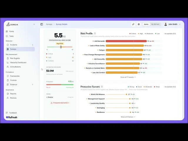
The Trend indicator. In the left stat column on the dashboard, showing whether your overall risk is improving, stable, or worsening since the previous survey, with the average change.
Per-hazard changes. The direction arrow on each Risk Profile row showing how much that hazard has moved, plus the vs-previous figure with more context when you click into a hazard.
Per-factor changes. The same direction arrow and change number on each protective factor.
Response rate across surveys. The Response Rate bar on the Surveys list, covering all your active surveys.
Key takeaways:
Direction arrows and change numbers only appear once you have a previous survey to compare against.
The dashboard Trend indicator gives you the overall movement; the per-hazard and per-factor arrows show where that movement is coming from.
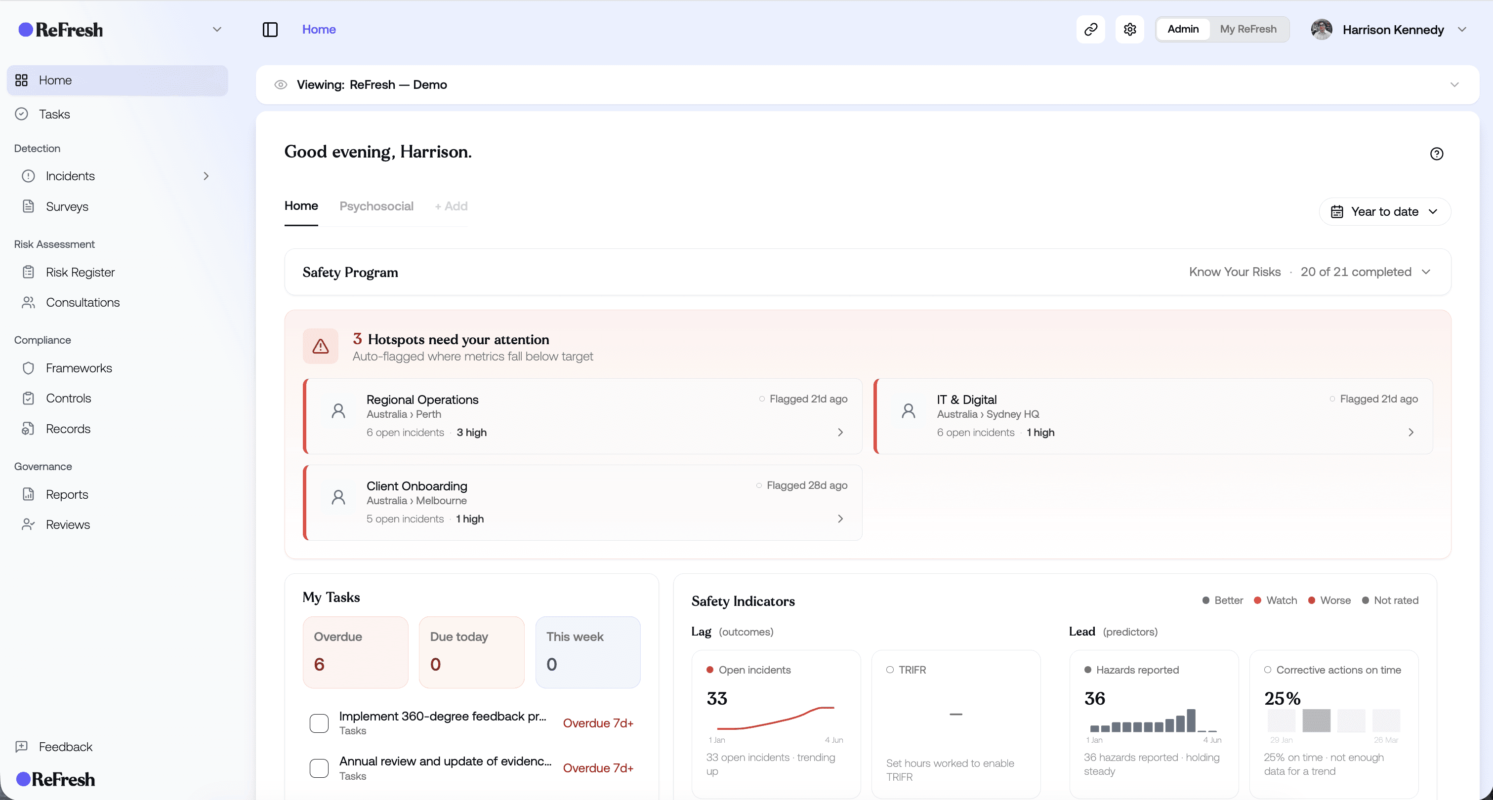
The Response Rate bar on the Surveys list tracks participation across all your active surveys, not just one.
IN THIS COURSE
3
.
E5. How psychosocial surveys work
3
min
3
.
E6. Choosing the right survey template and designing your first assessment
3
min
1
.
E7. Distribution strategy
1
min
1
.
E8. Reading your risk profile
1
min
1
.
E9. Drilling into hazard categories
1
min
1
.
E10. Protective factors
1
min
1
.
E11. The cost impact model
1
min
1
.
E12. Survey trends
1
min